ACROSS THE POND: JOHN-PAUL PHILLIPPE
By Lisa Zeiger

“As a woman I have no country. As a woman my country is the whole world.”—Virginia Woolf
1987 in London was the beginning of a beautiful friendship, a friendship that has lasted more than thirty years because it is disinterestedly devoted to beauty alone.
My London friend, the writer and art historian Simon Watney, introduced me to an Oklahoman from the tiny town of Henrietta with an equally unlikely name: John-Paul Phillippe, his boyfriend at the time, an artist and designer. In the 32 years I’ve known John-Paul, he continues to work within a stern aesthetic corral he built around himself himself long ago. He takes pleasure in choice reduced to a very few exquisite possibilities. His paintings, drawings and sculptures are undulating abstractions restricted in color to black, grey, white, amber-yellow, and his favorite hue, “cardboard brown.” He makes exceptions to his own rule, sometimes using blue, red, or green. Although John-Paul used to revel in London raves, and lets slide the foibles of others, about himself he was always a Puritan, from earliest childhood, he tells me. He is writing a memoir called Child Puritan.

John-Paul Phillippe at six; Child Puritan.
In London John-Paul used to quarantine himself in Simon’s Camden Town apartment, or in his tiny all-white studio within a huge Islington house with a Bloomsbury pedigree and many paintings by Vanessa Bell and Duncan Grant. But English heritage aside, John-Paul and I shared a haughty disappointment in the debased design of post-Post-War Britain.
Everywhere, even in important old houses and at the Turner room of the Tate Gallery, a horrible textured wallpaper known as “Woodchip” was used to cover cracks instead of honest plaster. Kitchens were uselessly equipped with uneven electric “cookers” the size of hotplates, and tiny, greasy stainless steel sinks. Where were the Aga cookers, and spacious stone and ceramic sinks we had seen in our favorite magazine, The World of Interiors? These small details of utility were hints of much larger visual ruin in the country that had led the Arts & Crafts Movement, spurring Modernism, after hundreds of years of architecture that was not merely beautiful, but radically inventive and deeply influential upon buildings in other countries. An adumbrated list includes Robert Adams, Nicholas Hawksmoor, Inigo Jones, William Kent, Sir Christopher Wren, Sir Joan Soane, A.W.N. Pugin, Sir Joseph Paxton, William Morris, C.F.A. Voysey, William Godwin, William Lethaby, Sir Edwin Lutyens, and, of course, Charles Rennie Mackintosh, whose few Glasgow masterpieces we would come to know well. Without exception, these architects had also been decorators, creating interiors to harmonize with their great buildings. Now, all was Woodchip.
On the Underground and British Rail the upholstery in brooding maroon moquette from the 1930s was giving way to dirty velours in orange and mustard, lit by the greenish-white glare of fluorescent lights instead of soft incandescent bulbs. On our frequent train trips between Glasgow and London, we imagined isolating our seats inside a tent of white canvas cloth, to shut out the beer-swilling, chip-munching passengers, and the dreary passing views of high-rise post-Brutalist “housing estates.”
We were snobs on a budget. We bemoaned the psychedelic defilement of London’s stately public buildings and dignified private banks, newly cloaked in “fun” colors, sheetrock, and acoustic tile. The screeching cobalt blue of a bank in Camden Town mars both our memories. Shop signs, even those of new chain stores, were the last street fossil of Britain’s former taste, still using the beautiful typeface, Gill Sans.
In 1988 John-Paul became my disciplinarian in Scotland in all matters of interior decoration. Together we absolutely invented--not “reinvented” as shelter magazines say-- an attic flat I’d bought in an 1850s house in Glasgow. In London I had spent the previous year studying history of decorative arts at Sotheby’s Education,, and was now doing post-graduate work on 19th and 20th century design at the University of Glasgow. I took art history personally, as a source for things I would live with. The allure of all the styles I studied were competing in my mind for a place in my new apartment. I was all over the place, and without John-Paul would have made my five new rooms into a horrible buffet, despite my canny eye for unusual objects.
One week I was enthralled by darkly vivid Regency colors and its preternaturally simple ornament; the next, much more so by Malmaison outside Paris, designed by architect-decorators Percier et Fontaine for Napoleon’s wife Josephine. From London or Glasgow I would sometimes fly to Cologne to see friends, always bringing back a piece of early 20th century German ceramic.
Then and now there has always been for me the Bauhaus, the first named design movement I became aware of at thirteen. I loved at first sight the tubular steel chairs, abstract woven tapestries, and Marianne Brandt’s silver teapot illustrated in a small Dutton/StudioVista paperback I found in an L.A. bookshop. Actually, besides love, I felt intellectually and emotionally magnetized by these designs, as if they fit perfectly a unique, oddly contoured space in my mind that had been vacated and shaped especially for their arrival. They moved me much more intensely than works of fine art, an inexplicable preference that remains and which I can’t completely explain.
In London the year before, John-Paul and I incessantly combed the flea market at Camden Lock, discovering at reasonable prices the ceramics and metalwork of nineteenth-century English proto-modernist, Dr. Christopher Dresser. I acquired a spherical beaten copper German teapot. We were furnishing a house. As we had no house, we began with ornaments, spinning out comprehensive decorative schemes from small, potent objects, a method of design reversing that of every professional interior decorator I have ever known. They all believe in beginning with the envelope, with architecture if possible, and if they can’t build or change that then they look first at floor coverings, followed by paint and textiles, etc. The small icons John-Paul and I snatched up would have been the very last step for any other designer. The copper German teapot was a nucleus, along with other 20th century German objects from the enchanted Galerie an der Wolkenburg in Cologne—-a bronze colored ceramic vase from Krefeld, a yellow Bauhaus pitcher, a small ceramic craquelure plaque of a face in vivid blue and white.
When I first moved to Glasgow, in September 1988, I stayed for a few months in a rented room. There I stashed furniture I’d begun to collect: a mortise and tenon mahogany screen, and a peculiarly narrow console table, its black beveled slate top supported by bony legs worthy of Richard Riemerschmid. Once I got the flat, John-Paul took charge, restraining my art historical excess with a strictly mapped palette which ultimately made a restful, more neutral background than I would have chosen myself. He taught me the lesson of consistency and echo among rooms. Only with great caution would he bring a new color near his baseboards, doors, and door and window frames painted at least three shades of grey, with other architectural elements in “cardboard” and bone white. The staircase was a Chinese red I dictated, with great success.

A selection of English and German early 20th century pottery on a Scottish handmade wood and slate table.
John-Paul and I began to conceive the rooms solely through the powers and auras of certain objects and colors: red, black, yellow, grey, inspired by Rietveld, minus bright blue. Green, also, was essential.
My attic apartment filled the top floor of a Victorian stone house within a graceful crescent of identical buildings. One climbed two flights of stairs to my front door, which opened on an interior wooden staircase that led to the apartment itself. The large central landing was crowned by a huge gabled skylight. Five rooms--two bedrooms on the street side; living room and kitchen facing an alley, with a skylit bathroom on the third side--radiated from this landing, its floorboards lacquered by John-Paul in a grey so pale it was almost white.
Faced with five whole rooms, I was elated and intimidated. Never, except in decorating a doll's house, had I possessed such fortune, so vast a stage—this one divided up with unusual charm—where imagination could be made material.

My Glasgow living Room, with Glasgow Style barrel chairs reminiscent of the Wiener Werkstaette, citrine walls and curtains, and a dado in Peigei Angus’s spherically patterned wallpaper in olive and gold, hand-printed by John-Paul. The lantern is in Clutha glass, the kind used by Dr. Christopher Dresser.
It had never occurred to me to use wallpaper; I was a student of objects rather than pattern.But John-Paul had just apprenticed himself to the legendary English artist, designer and maker of hand-blocked wallpaper, Pegei Angus. In her Camden Town studio, Pegei, an intimate friend the 1940s of the wonderful artist and engraver Eric Ravilious, produced roll after roll of beautiful papers, very plain stylized floral repeats derived from her work as a painter. The wallpapers John-Paul showed me convinced me to take this unprecedented design step, for they looked hand-made and imperfectly printed rather than slick and mass-produced. I knew at once which of the papers to use in my bedroom, in a deep charcoal grey, almost black, and a red almost pink, a dusky color, muted yet glowing. I love red, but the alternating vivid and dark shades of the paper--which I hung only as a low dado--allowed me to use it sparingly, yet dominate the room without making of it what Diana Vreeland famously called "a garden in Hell". My bedroom slowly became a sequestered, dimly beautiful territory.
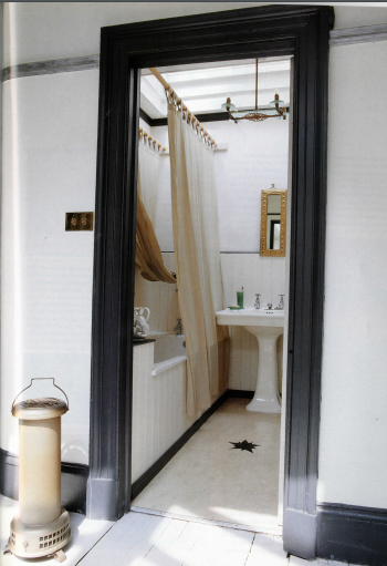
The Bathroom, with its own skylight, oval art nouveau basin and pale yellow Marmoleum floor with star insert by John-Paul.
The walls of the two bedrooms facing the street slanted inwards under the eaves, with attic windows sheltered by an arch. The casements opened out onto tiny balconies of cast iron overlooking a church. We covered the floor in a sisal patterned in small checks of dark grey and wheat color. On one side I planted the mahogany screen I’d found when I first came to Glasgow,, setting beside it a decomposing chaise longue covered in a rough grey wool army blanket. From the ceiling hung a silver latticed Arts & Crafts lantern with a single clear bulb. It was a room both sensuous and plain. The double bed was covered in a Scottish patchwork quilt of various pieces of brown tweed and plaid that resembled a Japanese textile. I was unaware at this stage of my decorating life that there were fabric houses with marvelous textiles to transform and soften rooms. I was Spartan about cloth, though not color, stuck on subdued tertiary hues. I would veer towards brighter colors later in life.

A guest bedroom under the eaves, with a curvaceous Aesthetic Movement screen stretched with roughly hand-woven silk.
The kitchen was the undoubted core of this house, a place where I read and studied as well as cooked all the time, mostly macrobiotic food I had learned to make at a course in London. John-Paul was intuitively expert at the same cuisine. When I moved in, this elongated room had been mauled by a cheap "fitted kitchen" and carpet swirling in orange and purple. John-Paul and I gutted every trace, determined to make a kitchen like those in Stately Homes, all hearth and open shelves. The plain, misty grey plaster the builder applied to the pocked walls looked so ancient and beautiful, we decided not to paint it. It had the dusty surface of a chalkboard, with depth and texture like a Cy Twombly painting or early all-black Brice Marden drawing. At a small weekly auction we bought a long neoclassical solid oak table, glass covering its polished top, that might have belonged to a library. In the Glasgow Herald, the classifieds advertised an old double gas oven with a griddle, in black, white and chrome. It was wide enough to display or hide the old heavy pots and pans, black-enameled with long horn-like handles, we found at flea markets.
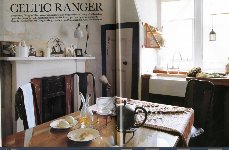
The Kitchen, heart of the house, with Japoniste working fireplace. Every piece of cutlery was hand-picked by John-Paul and me.
At great expense a new kitchen floor was laid of deep chocolate brown Marmoleum, the classic thick linoleum manufactured in Scotland by Forbo Nairn. Roddy, a carpenter with finesse and curiosity about our obsession with the old things his other clients got rid of, built an enclosure for the kitchen sink even more refined than John-Paul and I had visualized. From a priceless slab of solid mahogany Roddy crafted a grooved slanting draining board that let drops of water from wet dishes trickle into the sink.. The cupboard doors below the white porcelain butler's sink with its swooping nickel faucet were simple mortise and tenon in mahogany, the borders stained a dark blood red by John-Paul.
Another beauty of these rooms was that each had a real hearth, some of them walled over but easily excavated. I found cast iron fire surrounds impressed with Aesthetic Movement Japoniste designs and had them fitted into the larger fireplaces, installing in the kitchen a real gas flame that warmed the room. The slate table stood to the right of the door, displaying a small collection of ceramics, some broken and repaired.
The flat and our labors, so inspired in the first place by The World of Interiors, was honored by a long feature in that magazine in April 1993 under the amusing title “Celtic Ranger,” which referred to me. The late garden writer, Elspeth Thompson, wrote the piece, with eight sumptuous pages shot by photographer Polly Farquharson. Elspeth described me as exactly the solitary I feared I was becoming, quoting me at the very end, “Well, if you live for beauty, you’ve got to be prepared to die for it!” I was in Cologne when the magazine hit the stands, and I read this remark with surprise, not remembering I had told her anything so truthful.
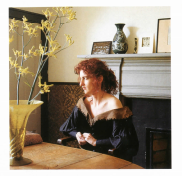
The author in her living room, dressed in a dark green gown, probably a costume from an opera.
In 1991, after two years I left Glasgow and sublet the flat. I ran off to Cologne where I wore myself out on the wheel of longing and gratification. After two years in that city, the wheel stalled at longing and stuck there.
In 1993 I made a long trip to India that could have been to anywhere, since I stayed completely enclosed in the Poona ashram of Baghwan Shree Rajneesh, already dead and renamed Osho. I saw and learned nothing of India. The media, obsessed only with Osho’s huge collection of Rolls-Royces, had always trashed him as a charlatan. At the ashram, videos revealed Osho to have been not only extremely funny, but uncomfortably truthful, likely the reason behind his bad press.
However curious this sojourn, as a rest cure it didn’t take. I flew back to Cologne, then returned to Glasgow by ferry, dragging eleven pieces of luggage across the Channel, spending my last few coins on beer and lockers at Ostende and Victoria.
In Glasgow, my beautiful attic apartment was still a close, which as an ancient noun means dead-end. I had very few friends there, no lover, and had never had any patience, anywhere. Suddenly and rapidly I dismantled all the perfection John-Paul and I--especially John-Paul--had created, and sold up. "The wise woman buildeth up her house; the foolish teareth it down with her hands."
By the time I was four years old, place had become a passion that almost exceeded anything I felt for a person. I responded very early to streets, buildings, houses, and rooms, with definite opinions about which were beautiful and which were not. Europe had always been the kingdom of my mind, but while living there the better, truer origin I sought packed its bags in the night and crept away to an unknown country I couldn’t find on any map. For seven years I had borrowed three countries. I didn’t belong to England, Scotland, or Germany, although my face and body--ignored in America--were wildly sought after inside that foreign triangle. To the British and Europeans, stupidity is not a sign of beauty.
In Manhattan, I slowly remade my life in the Upper West Side studio I had moved into at nineteen. Sadly but without regret I relinquished the dream of Europe which had furnished my childhood, like the fantasies of children who believe themselves to be the offspring of kings and queens, switched at birth; mistakenly adopted by barbarians.
“All of me/ Why not take all of me?” asks the jazz standard written in 1931 by Gerald Marks and Seymour Simons and made famous by Frank Sinatra. The word “American,” like “heterosexual,” has never described me with any accuracy although I accidentally belong to the two groups these words denote. I consider both categories to be be gigantic cults that far outnumber Osho’s and wildly surpass it in oddity.
Only New York, New York, the city in the title of Sinatra’s signature song, has ever taken all of me, more or less.
John-Paul also returned to New York City in the 1990s, becoming the design visionary and painter-craftsman behind the decorative schemes—murals, bas-reliefs, and sculptures— of Barneys Department Store, from Manhattan to Miami to Dallas to Tokyo.
My vital friendship with John-Paul, who continues to perfect a small japoniste compound of cabin and barn hidden in the woods of Connecticut, is one of the few full circles I admit into my present life. True friendship—or love—lasts only when it is founded on other, outside things that last: foreign objects beyond the blasted circle of self.

John-Paul Phillippe’s tiny cabin in Sharon, Connecticut; kitchen area.
POSTSCRIPT:
John-Paul’s latest exhibit, at Standard Space in Sharon, Connecticut, is entitled ‘Pond Life.’ In it, he paints a near-death experience, his recent fall through the ice of a not-quite-frozen pond. The suite of paintings number fourteen, like the Stations of the Cross, a sum John-Paul tells me is happenstance.
“The color palette is taken from that experience,“ Philippe says. “I use a color I’ve taken to calling ‘frozen mud,’ some elongated water-weed imagery, dappling, and rays of aquamarine that filter down.” John-Paul’s “cardboard” abides, now in near-aqueous form.

John-Paul Phillippe, Pond Life, emulsified gouache on linen, 10x8” 2019.
John-Paul still borrows visual ideas, materials and textures from his immediate surroundings. For the current show, canvasses were layered with fabric and some were even blackened with pitch, echoing the dark, rough-hewn wood exterior of his cabin. He points out that a scarf hanging on his studio door may have inspired the fringed, unfinished edge he’s decided to leave on one of his pieces.

John-Paul Phillippe, Grebe, gouache on paper in bronze frame, 44 1/2 x 30 1/2”.
“In many ways, the work is already done,” says Philippe. “I’m just collating it.”

The collecting and creating John-Paul and I exerted on the Glasgow flat are closely allied. As death, not by water but by nature, draws nearer, both of us hasten to complete our life’s work. At this late date, it is the things that fall through, or away, that matter, infinitely more than anything we can acquire.

John-Paul Phillippe, Amphibian, emulsified gouache on linen, mounted on panel, 16 1/2 x 16 1/2”.